He explained in details some of the thinking behind the ever-so-subtle changes. The new icons will start to appear across the devices very soon. Hu examined the refreshed logo design in next several tweets:
Some of you might have noticed a new icon in Chrome’s Canary update today. Yes! we’re refreshing Chrome’s brand icons for the first time in 8 years. The new icons will start to appear across your devices soon. pic.twitter.com/aaaRRzFLI1
— Elvin 🌈 (@elvin_not_11) February 4, 2022
Hu explained that the team has simplified the main brand icon by removing the shadows, refining the proportions and brightening the colors.
Elvin made an interesting point that placing certain shades of green and red next to each other created an unpleasant color vibration. Just because of that the team introduced a very subtle gradient to the main icon to mitigate that, making the icon more accessible.
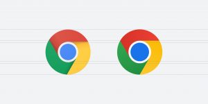
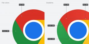
The team created OS-specific customizations in order to make the icons feel recognizable but also well crafted for each OS. For example, on Windows, the icons take on an obviously graduated look, appearing at home on Windows 10 & 11.
The team updated the ChromeOS, using brighter colors without gradients to match the looks of the rest of system icons. In fact, on macOS, they look 3D whereas for Beta and Dev, the team applied colorful ribbons.
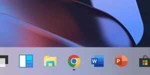
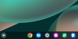
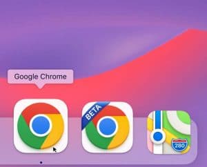
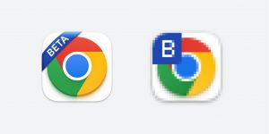
The ribbons can also transform into simple badges at small sizes, maintaining their legibility. Speaking in more detail, the letters “B” and “D” representing “Beta” and “Dev” are manually hinted, so they look crisp at a very small size.
The Beta app on iOS will be using a blueprint-like design, as a nod to Apple’s developer-focused apps. The Stable app icon will also have new proportions on the tile.
Chrome’s experience has been also tailored to each OS, including features like Native Window Occlusion on Windows, day-one M1 support on macOS, Widgets on iOS/Android, and Material You on Android.
Furthermore, the team explored introducing more negative space. More specifically, the white required a stroke that shrunk the icon overall, and made it more difficult to recognize, especially next to other Google apps.

Elvin concluded that In the next few months, customers will start to see the refreshed version in app, on the web, and beyond. He also noted that the Google Chrome team is always happy to receive feedback from customers so that they can explore more ways to improve their work.
]]>