
After three alphas, three betas, and a few months of hard work, Bootstrap is shipping the first stable release of its new major version. Here are some of the new features of Bootstrap 5.

Photo Credits: Bootstrap Blog
New logo
One of the biggest changes with v5 came with its redesigned logo and updated docs design.
New offcanvas component
The new offcanvas component comes with a configurable backdrop, body scroll, and placement. Offcanvas components can be placed on the top, right, bottom, or left of the viewport. Configure these options with data attributes or via the JavaScript APIs.
New accordion
The .card accordion component with a brand new .accordion component is solving several bugs in the process. The new accordion still uses the Collapse JavaScript plugin, but with custom HTML and CSS to support it. Visit the new docs page to learn more.
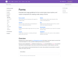
Photo Credits: Bootstrap Blog
New and updated forms
Here are the new Forms documentation and components. All Bootstrap forms are consolidated into a new Forms section to give them the emphasis they deserve. Alongside new docs pages, all form controls are being redesigned and de-duped. With v5, Bootstrap has become fully custom.
Checks and radios
Every checkbox, radio, select, file, range, and more includes a custom appearance to unify the style and behaviour of form controls across OS and browser. These new form controls are all built on completely semantic, standard form controls.
Floating labels
Floating labels include support for textual inputs, selects, and textures. There is one limitation with text areas where multiple lines of text can be obscured by the floating label, however, the Bootstrap team is working on fixes for this. The custom .form-file class has been dropped for additional styles on the .form-control class so there won’t be any additional JavaScript to make file input styles functional.
Simplified layout
Using the new grid updates, form layout has never been easier. The new .form-group, .form-row, and .form-inline have been dropped for the grid system.

Photo Credits: Bootstrap Blog
RTL is here!
RTL support is officially added to Bootstrap! Here are the changes:
- New RTL versions of our CSS dist file
- New RTL documentation
- Five new RTL Examples that show the new RTL CSS in action
- Two new cheatsheet kitchen sink pages
Bootstrap’s approach is built on RTLCSS.
Overhauled utilities
Bootstrap invested in adding more utilities along with a new method of managing them across projects.
New utility API
A brand new utility API has been utilised in Bootstrap 5 as the primary way to extend Bootstrap’s default utility classes. Easily generate and customize utilities with support for custom class names, support for generating state-based classes like hover, print versions, and more. Head to the new Utility API docs to learn more.
New utilities
Other utilities include:
- Added positioning utilities: top, right, bottom, and left with 0, 50%, and 100% values
- Added .d-grid option, along with new gap utilities for easy grid layouts
- Added .fs utilities for font-size
- Renamed font-weight utilities to .fw
- Added .rounded-1, .rounded-2, and .rounded-3 for new small, medium, and large border-radius utilities
- Added .overflow-visible and .overflow-scroll utilities
Check out the Migration guide and utility documentation for more details.
Logical properties for spacing utilities
Part of our approach to adding RTL to Bootstrap was to add it in a way that felt future-friendly to ourselves and the web at large.
Photo Credits: Bootstrap Blog
New snippet examples
These new snippet examples feature several variations of common components, served up in different ways for you to easily copy and paste.
These new snippets will continue to grow with new additions over time, showing just how fun and easy it is to build with Bootstrap.
Grid and layout
The grid system and layout options saw some changes to streamline and improve things, namely:
- Column classes can now be used as width utilities (e.g., .col-6 is width: 50%) as padding is no longer applied outside a .row.
- New gutter utilities can responsively customize horizontal and vertical grid gutters.
- Removed position: relative from column classes
- Dropped the .media component for utilities
Check out the Migration guide and layout documentation for more details.
More component updates
Across the board there are a number of other enhancements and changes to key components:
- Bootstrap has overhauled the JavaScript and positioning for our dropdowns as part of our adoption of Popper 2.
- Dropdown menus now have a new .dropdown-menu-dark modifier class.
- Carousels now have a new .carousel-dark modifier class to invert the controls, text, and indicators.
- Added icon examples to our Alert component
- The close button has been redesigned with an SVG background image and improved cross-browser styling.
- Bootstrap has dropped the .btn-block class for utilities.
- It has updated navbars with a new .navbar-nav-scroll for vertical max-height and scrolling of when a collapsed navbar is opened
- List groups have a new .list-group-numbered modifier class that uses pseudo-elements to create numbered list group items.
The other updates also covered
– Improved customizing
– Dart Sass
– JavaScript
– Migration guide
If you are interested to learn more about the news, announcements for all thing Bootstrap, including new releases, Bootstrap themes and Bootstrap Icons go to The Bootstrap Blog.

